
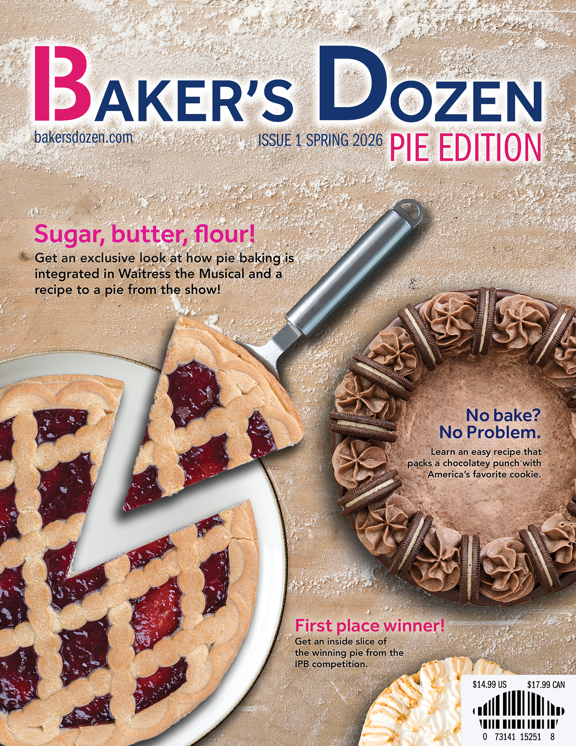
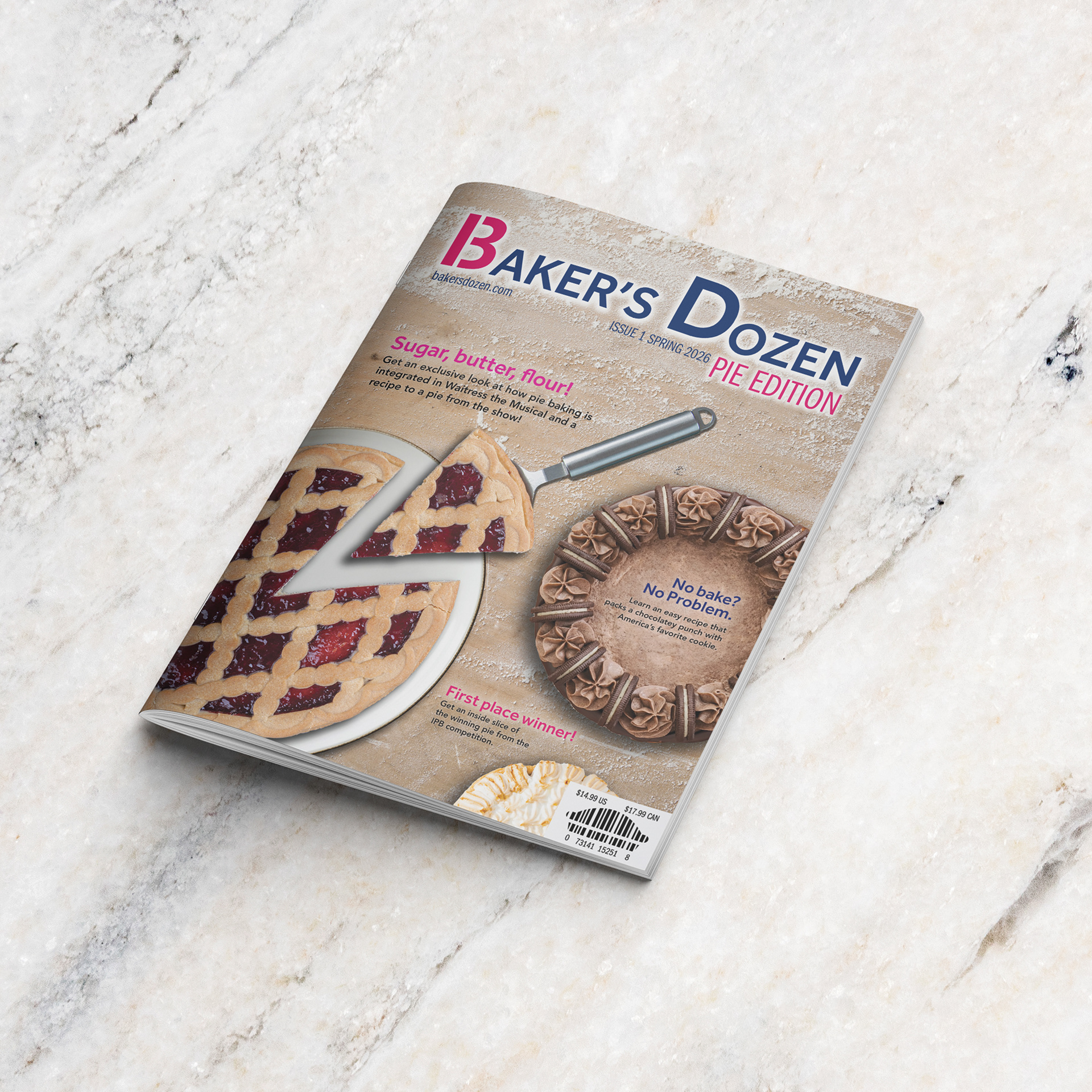
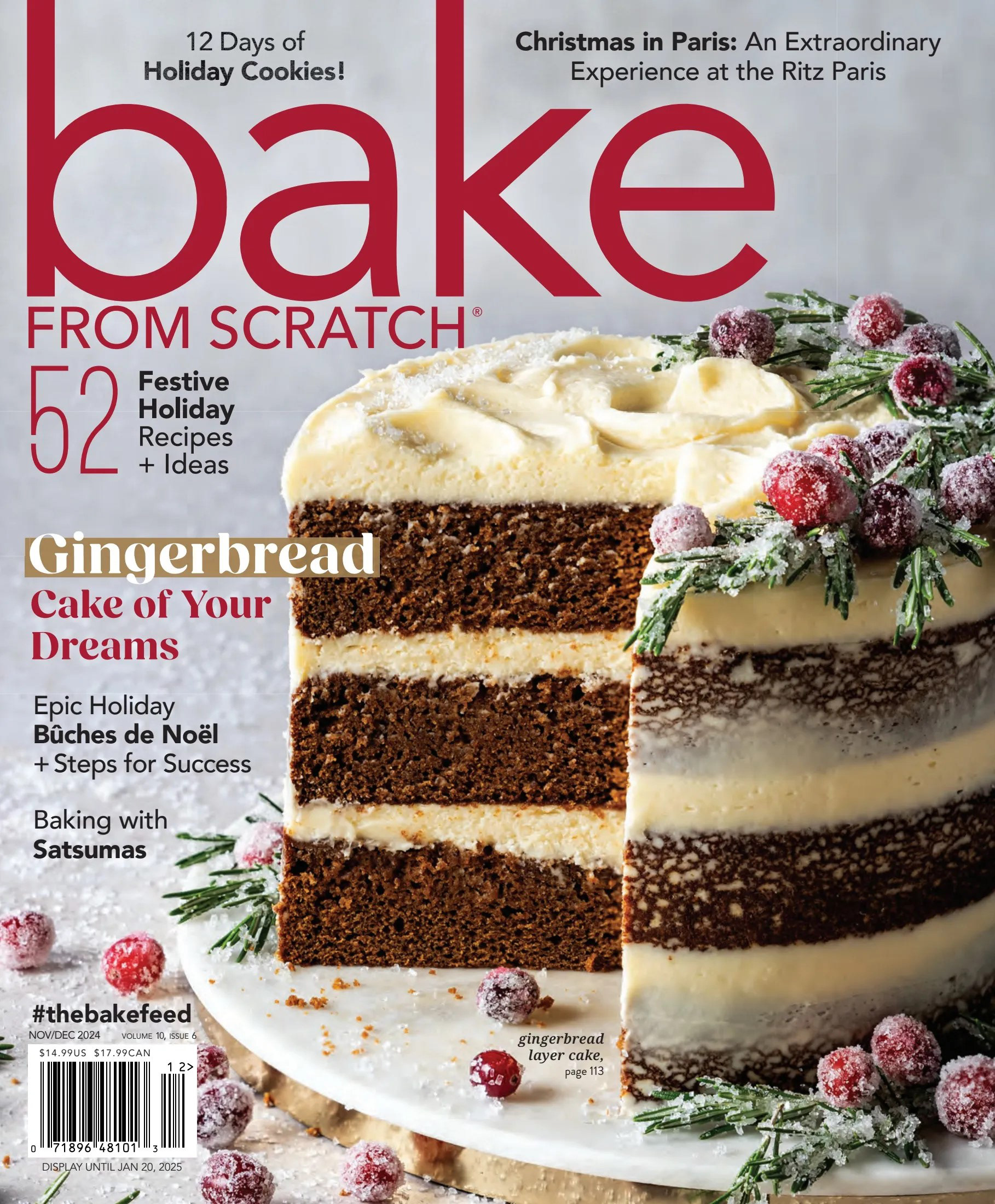
bakers. By referencing industry-established magazine aesthetics, such as imagery of baked goods paired with sans-serif typefaces, I made sure that the Baker’s Dozen brand felt instantly recognizable and familiar to the target demographic.

For the Baker's Dozen Logo, I wanted to express the brand's modern professionalism by using a sans-serif typeface. To highlight the magazine line's speciality of providing 13 recipes with each release, I edited the B of the typeface to be split into the number 13, the number commonly known as a baker's dozen (12 + 1 extra for taste testing).
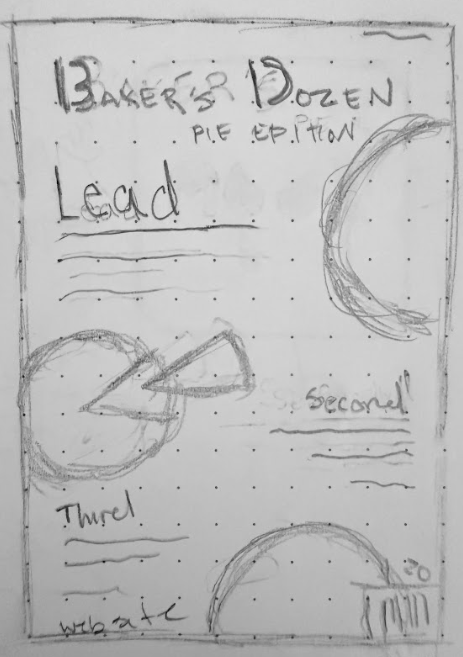
Initial thumbnail of final design. This iteration was selected out of four other thumbnails. I wanted to utilize the shapes of the pies to help guide a viewer's eye down a zig-zag line.
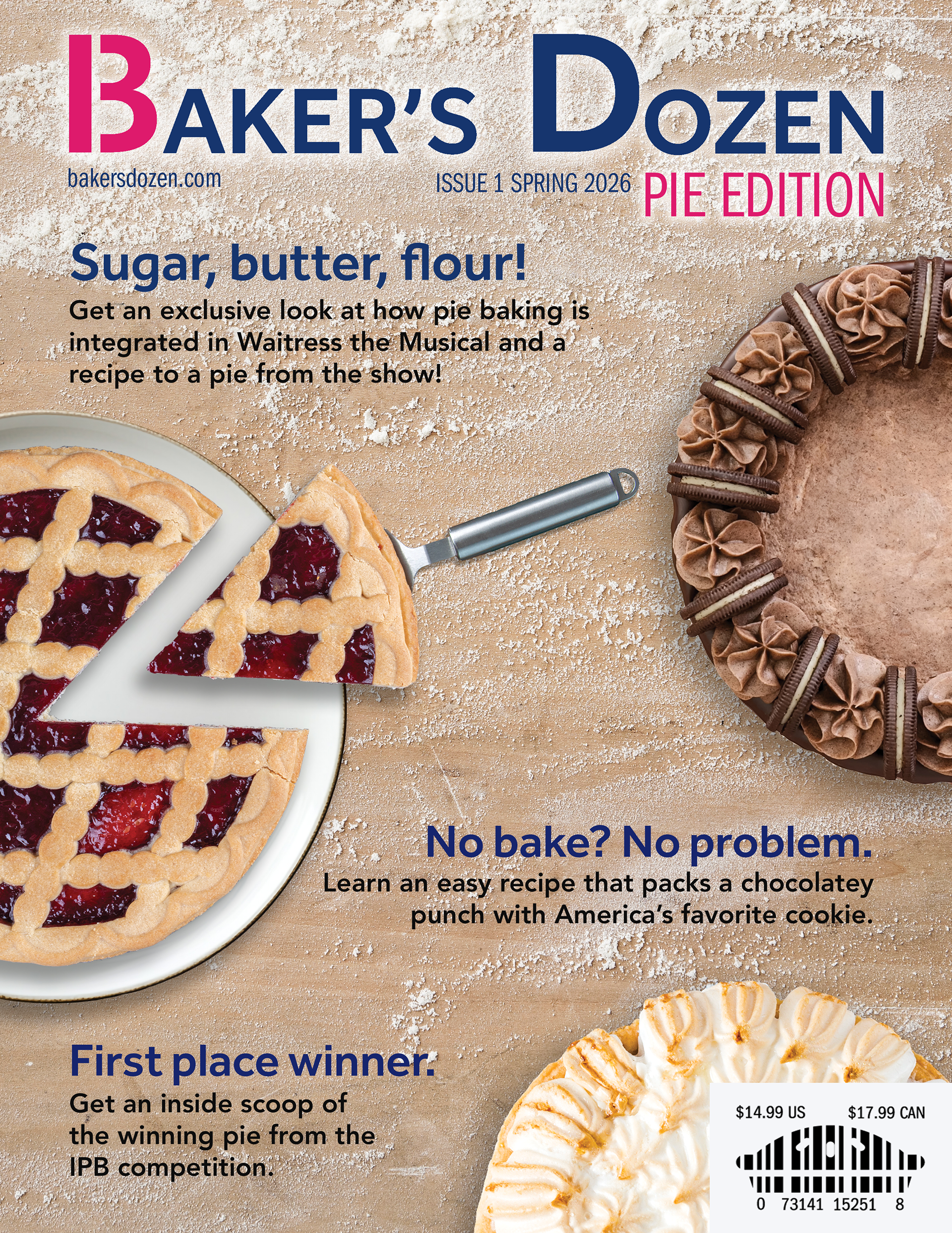
Attempt #1 of conception. The feedback received from this version was that the title of the brand, the most important element, had very little visual weight compared to the photographic assets of the pies. Additionally, the holes in the pie-barcode were treading the edges of the lines, which felt unnecessary.