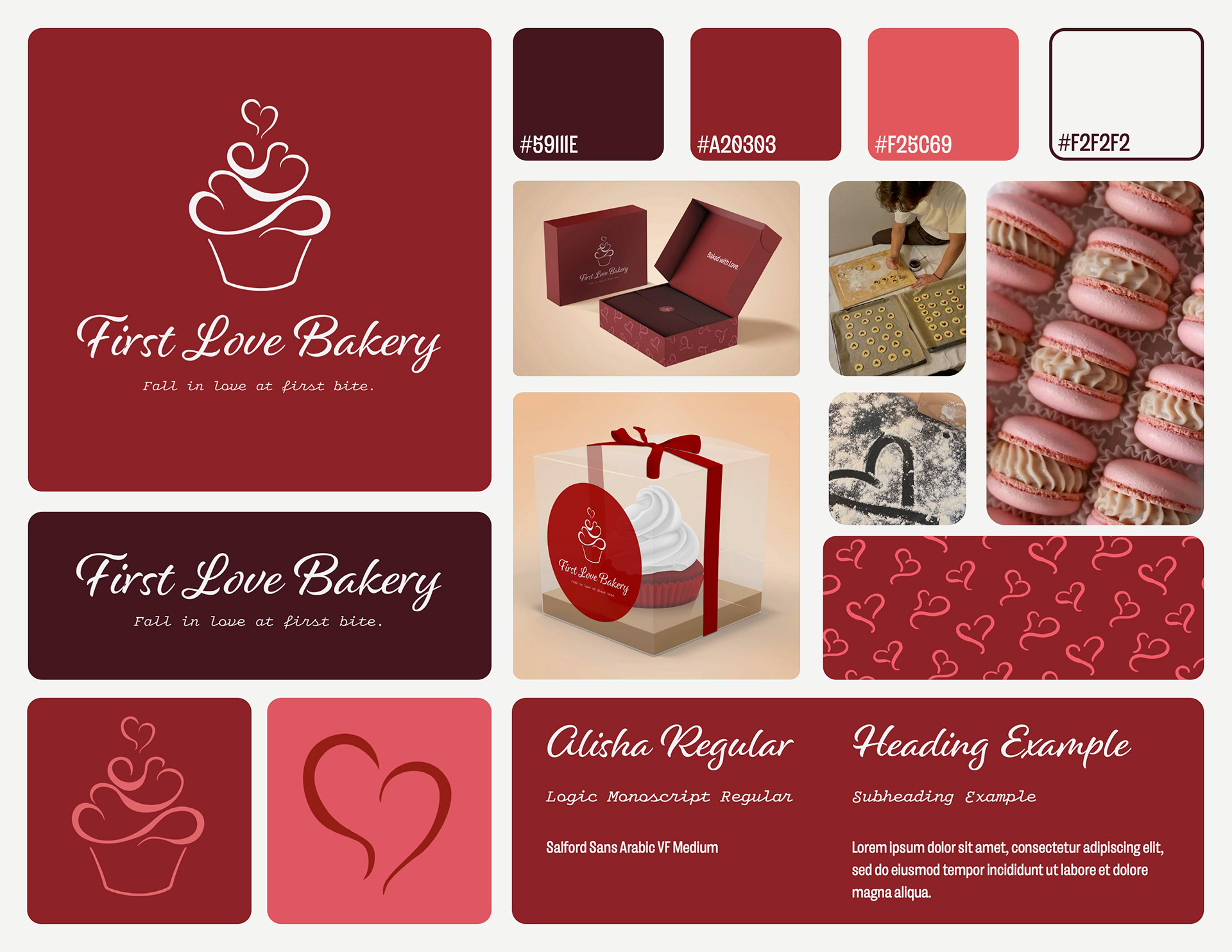
Project Goal
Develop and design a brand identity board for First Love Bakery, including primary & secondary logos, submarks, a color palette, typefaces, mockups, photography, iconography, and/or patterns.
Summary: First Love Bakery is owned and operated by a married couple whose partnership
began in the kitchen. To reflect their journey from a home-based start-up to a professional bakeshop, I used a monochromatic red color palette to convey passion and warmth, and selected calligraphic typefaces to convey sophistication. The brand’s primary logo incorporates heart motifs to reinforce the central theme of love, while the secondary logo features two rising steam lines. These lines serve a dual purpose: to represent freshly baked goods and symbolize the husband-and-wife duo. When joined, the lines form a heart, illustrating that the business and the couple are only complete when they work together.
began in the kitchen. To reflect their journey from a home-based start-up to a professional bakeshop, I used a monochromatic red color palette to convey passion and warmth, and selected calligraphic typefaces to convey sophistication. The brand’s primary logo incorporates heart motifs to reinforce the central theme of love, while the secondary logo features two rising steam lines. These lines serve a dual purpose: to represent freshly baked goods and symbolize the husband-and-wife duo. When joined, the lines form a heart, illustrating that the business and the couple are only complete when they work together.
Applied Skills: Brand storytelling, symbolism, color theory, typography.
Made with: Adobe Photoshop, Adobe Illustrator, Adobe InDesign
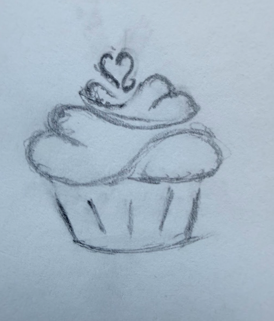
Logo Sketches
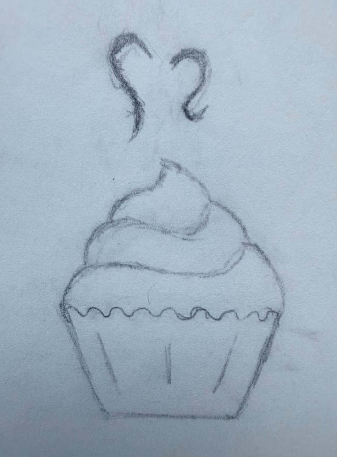
Logo Sketch #1 - I wasn't satisfied with this iteration, as the two smoke lines at the top of the cupcake, felt disconnected when creating the heart.
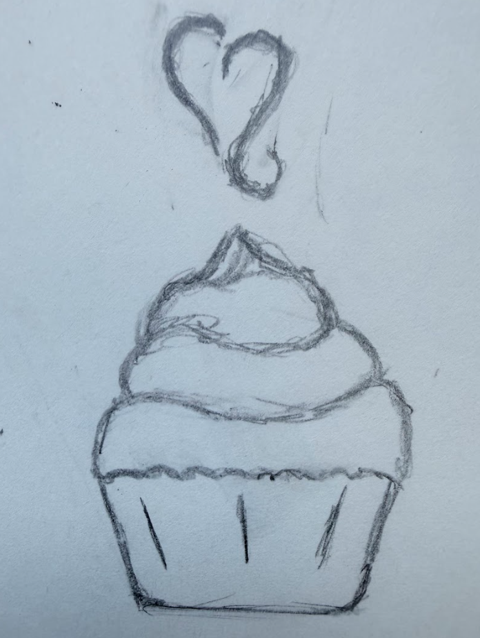
Logo Sketch #2 - While a step in the right direction, I had then thought the cupcake and the heart we're two separate entities, rather than one.